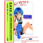
I’m not sure what to say about this choice but its pretty much the most fugly packaging I’ve seen in years. From what I hear it is raising sales and making the DVDs stand out more on the shelves,  but I must say the color is unnatural on my shelf which is a mix of black, blue, red, and oddly enough green xbox 360 containers though that is the case not the sleeve so its not as bright as these S.A.V.E. labeled DVDs. I just don’t care for them, and I wish they would just shrink down the big ugly label and let the animes title take up more real estate on the side and front. They could have settled on a little green stripe that wraps the cover but no they went for the over sized label that says hey I’m cheap but I’m ok with that, to be honest I love the price point, most around $20 for an entire series. By all means the quality of the anime is still there and the product itself is solid, I just don’t like that ugly label.
Copyright © 2026 | WordPress Theme by MH Themes


Leave a Reply